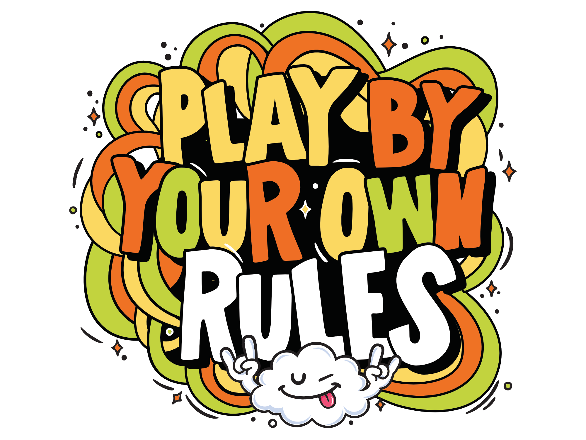
Most display fonts are designed to be safe. This one was designed to be used.
Playful Sans started as a lettering study — what happens when you take a rounded, friendly skeleton and push it to display scale? The friendliness doesn't disappear. It amplifies. Set it at 12px and it reads cute. Set it at 12 inches and it hits like a wall.
That push toward bold and confident didn't come out of nowhere. Made By James — chunky, hand-drawn sans display work, built loud and shared in the open — was proof that friendly didn't have to mean small or safe. That's the kind of reference that sticks.
Three cuts because one never covers it. Regular gives you the foundation. Jitter gives you the energy. Outline gives you the layer. Use one. Stack all three.
"FUCK THE RAT RACE" is not a throwaway in the specimen. It's a positioning statement. The type earns it.